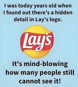
The Lay’s logo is one of the most instantly recognizable symbols in the global snack industry, and its appeal lies in how effortlessly it communicates warmth and joy. At a glance, it feels friendly, familiar, and inviting, qualities that align closely with how people experience the product itself. The design avoids sharp edges or aggressive visuals, instead relying on softness, balance, and brightness to create emotional comfort. This is no accident. Lay’s has long positioned itself not as a luxury or indulgence reserved for special occasions, but as an everyday pleasure woven into ordinary moments—watching television, sharing laughs with friends, or enjoying a quiet break. The logo functions as a visual shortcut to these experiences. Over decades, even as packaging and marketing campaigns evolved, the core visual identity has remained reassuringly consistent, helping consumers form an emotional bond rooted in trust and familiarity.
At the center of the logo sits a bright yellow circle, a deliberate and powerful design choice. Yellow is universally associated with warmth, optimism, and energy, making it especially effective for food branding. It also stimulates appetite, subtly encouraging positive associations with taste and enjoyment. The circular shape reinforces these feelings further. Circles are perceived as friendly, inclusive, and complete, lacking the tension or rigidity of angular forms. In the case of Lay’s, the circle cleverly mirrors two ideas at once: the sun and the potato chip. This dual symbolism suggests freshness, natural ingredients, and warmth, while also visually connecting the logo to the product itself. The glow-like highlight applied to the yellow surface enhances the sense of vitality, making the logo feel alive rather than static.
This sun-like imagery plays an important role in the brand’s emotional messaging. The idea of brightness implies that Lay’s wants to enhance everyday moments, not dominate them. The logo does not shout or overwhelm; instead, it radiates friendliness and ease. This aligns with the brand’s long-standing tone of voice, which emphasizes simple happiness rather than excitement driven by excess. The glow suggests comfort and reliability, as if Lay’s is a constant presence that can lift moods in small but meaningful ways. In branding terms, this positions Lay’s as emotionally accessible. It is not aspirational in the sense of exclusivity, but aspirational in its promise of uncomplicated joy, making it relevant across age groups, cultures, and lifestyles.
Wrapping around the yellow center is the red ribbon, a contrasting element that adds energy and movement to the design. Red is one of the most powerful colors in food branding because it attracts attention and stimulates appetite. In the Lay’s logo, however, it is softened by its curved, flowing form. Instead of sharp lines or heavy blocks, the ribbon feels dynamic yet gentle, adding motion without aggression. This balance is crucial. The red provides excitement and flavor cues, while the smooth curves ensure the logo remains friendly and approachable. The ribbon also serves as a visual anchor for the brand name, guiding the eye naturally toward the typography while creating a sense of depth and dimension.
The interplay between yellow and red is central to the logo’s success. Together, they create high contrast for visibility while maintaining emotional warmth. This makes the logo highly effective across a wide range of contexts—from large billboards to small digital screens. The colors are bold enough to stand out on crowded shelves yet comforting enough to avoid visual fatigue. This consistency reinforces brand recognition, ensuring that even a quick glimpse is enough to trigger association. Over time, these colors have become inseparable from the Lay’s identity, functioning almost as a visual language that communicates taste, mood, and familiarity before a single word is read.
Typography completes the logo’s personality. The Lay’s wordmark uses rounded, slightly tilted lettering that feels casual and friendly rather than formal or corporate. The curves echo the circular elements of the logo, reinforcing visual harmony. The slight tilt adds a sense of playfulness and motion, suggesting enjoyment rather than rigidity. White lettering ensures clarity and readability while symbolizing simplicity and honesty. Importantly, the typography does not overpower the symbol; it integrates seamlessly, allowing the name and the imagery to work together as a single, cohesive identity. This design choice supports Lay’s positioning as approachable and unpretentious, reinforcing the idea that the brand is for everyone.
Taken as a whole, the Lay’s logo communicates a clear and consistent message: happiness does not need to be complicated. Through color, shape, and type, it expresses warmth, ease, and enjoyment in a way that feels timeless. The logo does more than identify a product; it acts as a reminder of shared moments, casual pleasures, and small joys that fit naturally into daily life. Its enduring success lies in its emotional clarity. Rather than chasing trends, Lay’s has maintained a visual identity that speaks directly to human comfort and connection, ensuring that generation after generation continues to recognize and trust the brand.
Summary
The Lay’s logo uses color, shape, and typography to communicate warmth, simplicity, and everyday joy. Its yellow circle, red ribbon, and playful lettering work together to create a friendly, timeless identity that reinforces the brand’s promise of uncomplicated pleasure and emotional comfort.
